
Over the past few weeks I have become increasingly frustrated with the media visualisations of the spread of COVID-19, and especially the comparisons between countries. Linear graphs and logarithmic graphs are equally confusing – both requiring the eye to judge whether a line is flat or curved or changing. So I decided to build my own – in Excel.
Objective
My objective here is simply to visualise the available data, and provide some interpretation. I am not producing a predictive model, nor am I comparing the approaches across different countries – I’ll leave that to the epidemiologists.
However, I do hope to improve our understanding of the statistics available, and especially to highlight that across all countries that there is clear an consistent improvement.
Approach
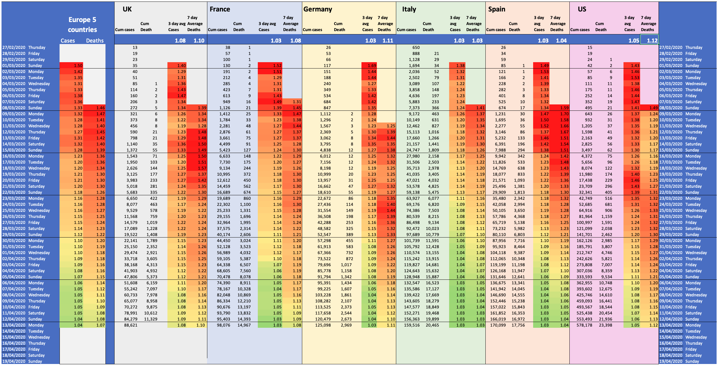
I’ve taken a simple view – in an epidemic which is, by definition, exponential in growth, the thing that matters is not the absolute count of cases or deaths, but the ratio of today’s stats to yesterday’s – so that’s what I have focused on.
The ultimate aim in an epidemic is, of course, to have zero new cases each day. While this does not mean that the disease has gone away – there may be many thousands of people still suffering from the disease – it does mean that the growth of the disease has stopped.
If we have zero new cases in a day, then the number of cases is the same as the previous day – so the ratio (I’ll call it R) will be 1.
I.e. the number of cumulative cases is the same as the previous day, so in terms of ratio, then that is a figure of 1.0, and so, in my visualisation, 1 is given a green light. Red, on the other hand is a little more tricky, in the early days of the epidemic there might be a few high numbers, but generally, a ration of 1.5 is a good compromise for red. Between the two I used a graded colour scale.
The Data
The data for the visualisation comes from Wikipedia. Most countries have a dedicated page to following the spread of COVID-19 in the country, and use the same graphing and reporting formats which makes data collection easy – I haven’t automated this – I just add a few figures each day.
Across the six countries I map the reporting methods, testing strategies, populations etc are all different. However, if we stick to focusing on the daily ratios, then all those disappear as the only things that actually matters is getting the rate of growth down regardless of all those other factors. This does open up the possibility of a country significant changing its testing or recording strategy, but I’ve simply decided to ignore that.
There is a huge question in many countries of the timeliness of the reporting – certainly in recording deaths, but also in recording test results. There is also good evidence that statistics gathering slows over weekend, and then catches up later – often appearing as a big bump in Tuesday fugures, and often drop in Wednesday; this can be seen in multiple countries. However, it does appear that most test results get recorded within 3 days and most deaths within 7 days at least for hospital deaths – which are the figures I have used. To mitigate this, I have calculated the 3-day running average for test counts and the 7 day average for counts of hospital deaths.
I’ve also included a simple average across all five European countries in the visualisation.
Some Interpretation
There are remarkable similarities across countries, despite the often heated arguments about how best to address the disease or the harshness of the lock-down approaches.
The reduction in R over time followings very much the same pattern (although at different start times) across all countries.
Here are some specific observations :
- After a lock-down is imposed, the R for the number of cases initially drops by c. 0.07 per week for a couple of weeks.
- Once R hits around 1.05, then further reduction is much slower
- The reduction in ratio of deaths follows the reduction in cases with a delay of 7-10 days depending on the country. (This may reflect the speed of reporting of deaths)
- Italy’s figures were initially ahead of most other countries by 1 or two weeks, however those differences have latterly reduced with Spain and France just a few days behind.
- The UK and US have converged to a similar position from quite different starting points
In general, and in terms of the growth rate (R), countries are all converging to a similar position. However, the actual number of daily cases is hugely different.
My final conclusion is taken from the European average across the five countries. Since the 1st March, the average R across those countries has decreased from 1.5 (doubling in less than 2 days) to 1.05 (doubling in 10 days) and the lead countries are down to 1.03 (doubling in 15 days).
Whilst the size of the human tragedy is still enormous, the collective action around the world has already made an enormous reduction in the growth of the disease – giving our essential services an opportunity to respond and save lives.
